Beyond the Paint Chart
Colour is the first thing people notice and the last thing they feel confident choosing. That is because most people approach it the wrong way.
Standing in a DIY shop holding a fan deck of two hundred shades of white is not how good colour choices are made. Colour needs context — the light in the room, the materials around it, the furniture that will sit against it. A colour that looks perfect on a tiny swatch can feel entirely different at scale.
We always test colours in situ. Large samples painted directly onto the wall, observed across a full day as the light changes. It sounds like a small step, but it prevents the kind of expensive mistakes that lead to entire rooms being repainted within six months.
Building a Palette
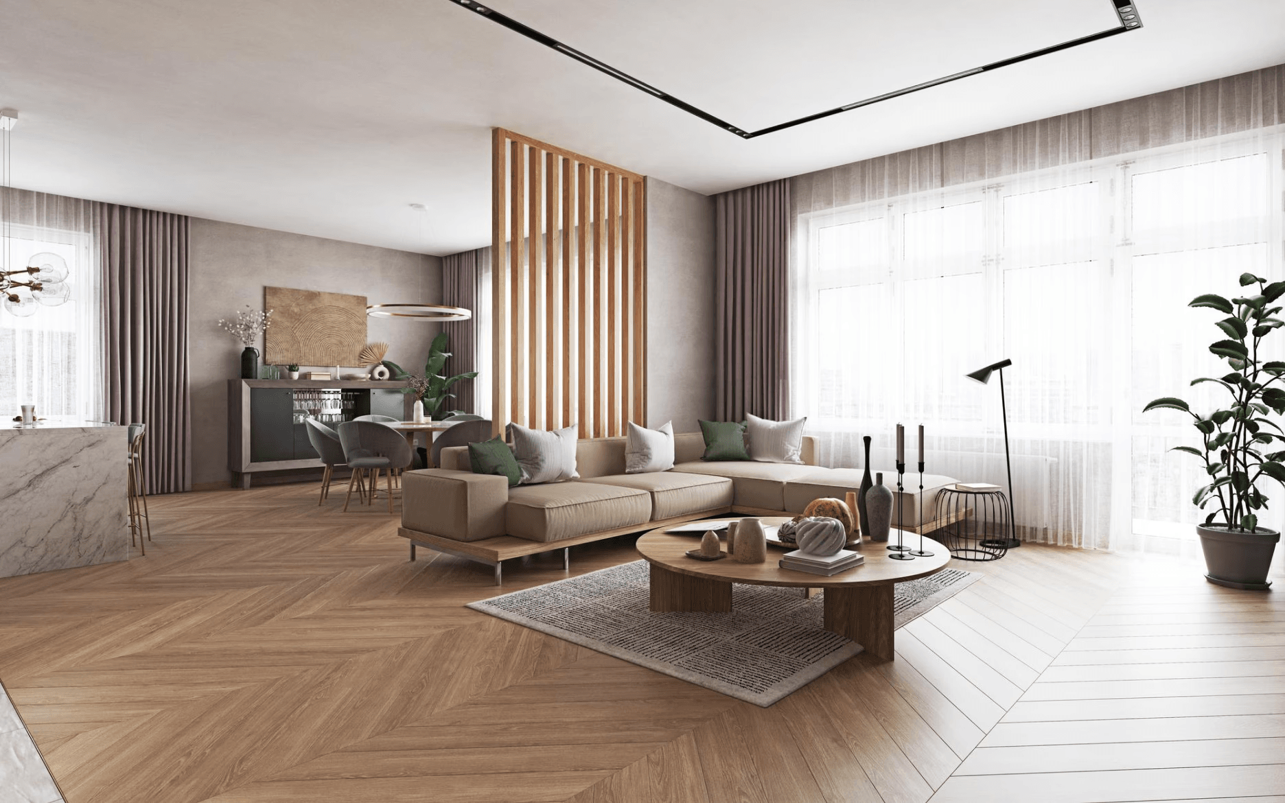
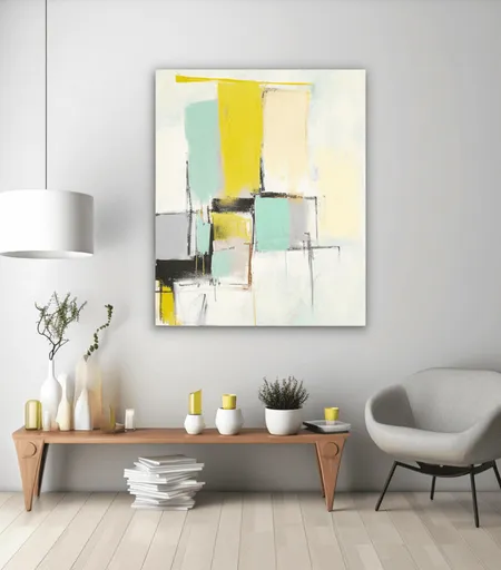
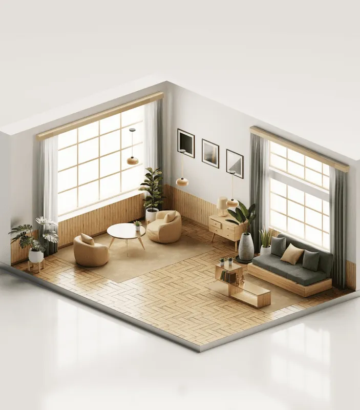
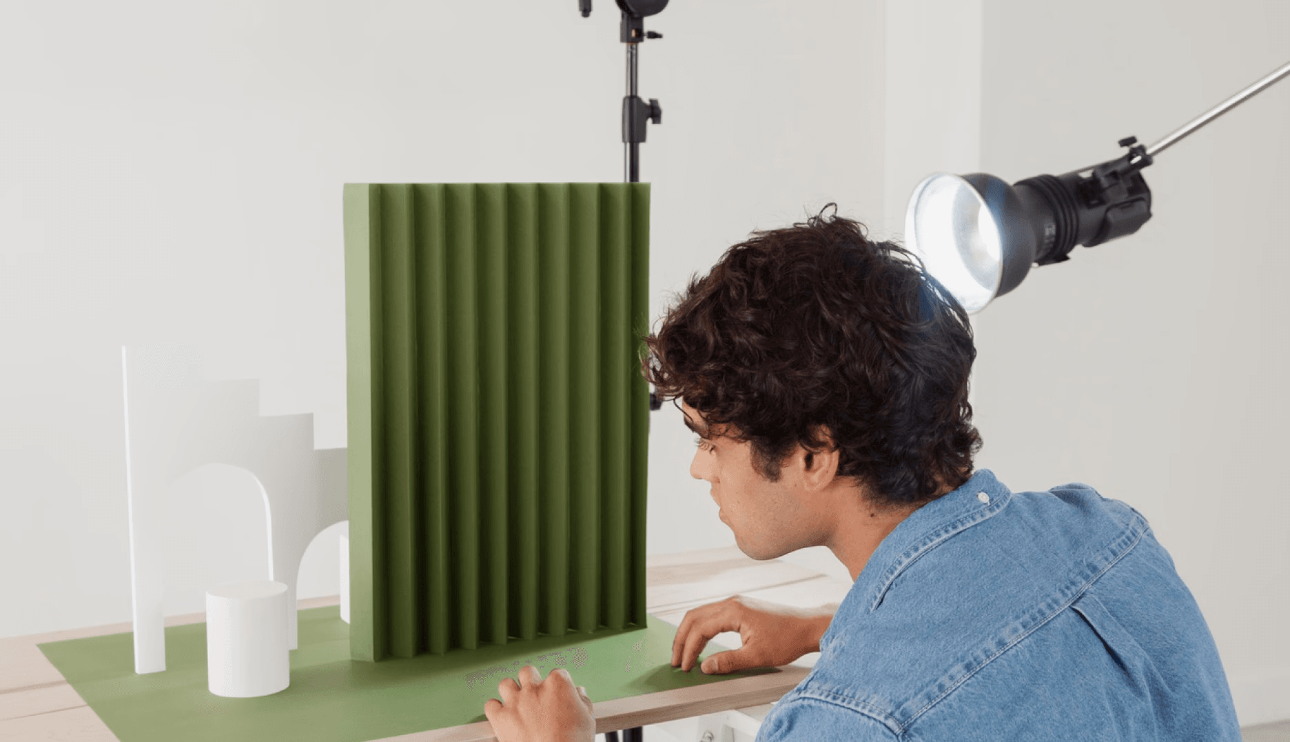
A strong colour palette typically has three to five core tones that work together. A dominant colour (usually for walls), a secondary colour (for larger furniture pieces), and one or two accent colours (for cushions, artwork, and accessories).
The key is balancing warm and cool. A room that is entirely warm tones — creams, terracottas, rich woods — can feel heavy. Add a cooler element, perhaps a blue-grey linen or a sage green plant, and the whole thing lifts.
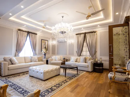
The most timeless palettes are rooted in nature. Earthy neutrals with moments of deep green, warm clay, or soft blue. These combinations have been beautiful for centuries and will still be beautiful in twenty years.
Colour and Mood
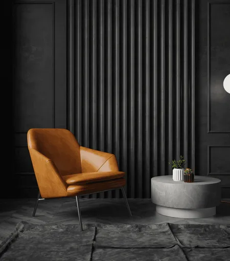
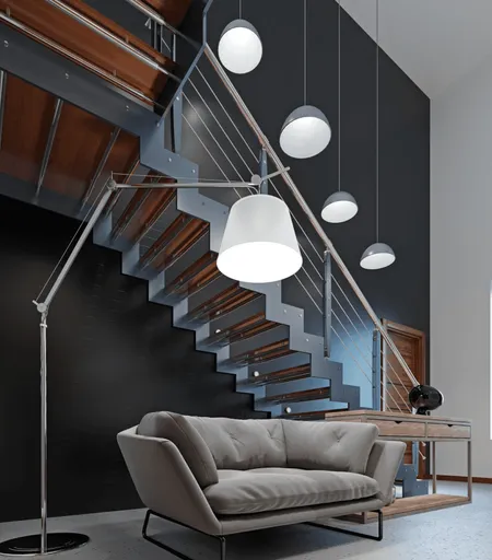
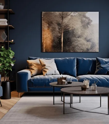
Different colours create different emotional responses, and this matters more than most people realise. Blues and greens tend to calm. Warm neutrals create a sense of comfort. Deep, saturated tones — navy, forest green, charcoal — add drama and intimacy.
The right choice depends on how you want the room to feel, not just how you want it to look. A bedroom should feel restful. A kitchen should feel energising. A sitting room should feel welcoming. Start with the feeling, and the colour follows naturally.